The impact of aggregation on data granularity and the observability

I recently came across a tweet by Brent Ozar who touched on a very important aspect of performance monitoring. A subject that is not always well understood and can lead to misleading results. The impact of aggregation on granularity and thus observability. Brent’s tweet inspired me to try and explain the matter in more than 160 characters. I will also touch on how SQLWATCH tries to deal with this problem.
I’m not promoting Charity’s tweet here to throw shade at any database monitoring tool – they ALL do this because they HAVE to aggregate data – but this is an important concept to understand. When you look at 5-15 minute averages over time, data was thrown away to get there. https://t.co/oKmzMgBDPX
— Brent Ozar (@BrentO) January 19, 2020
I have already blogged about time intervals and the impact on observability back in 2018. However, I did not go into details:
What is data granularity
Simply speaking, granularity is the amount of information contained within the data structure. In our case, we could say, this will be how often we are gathering (sampling) Performance Counters. The more frequent sampling, the higher the granularity (resolution) of the data points over time.
What does performance monitoring have in common with Compact Disc?
I like to compare data sampling in performance monitoring to analogue to digital signal conversion. Analogue signals are time-continuous, often with variable amplitudes for each time instance. The core part of the digitisation process is source signal sampling. The analogue to digital converter samples the analogue signal over a period of time and assigns a number of bits representing the original value. The higher the sampling frequency the closer the digital signal to the original and of higher quality.
Compact Disc was introduced in 1982, was not the first digital media but certainly the most popular. Around 1990 it overtook vinyl and cassette and only started to decline in early 2000 due to the internet, MP3s and the iPod. CDs use encoding standard called Pulse-Code Modulation (PCM), which is a way of converting analogue sinewave signals into digital equivalent, by regularly sampling the original. The standard sampling rate was and still is 44100Hz. This means the original signal was sampled 44100 times per second. Later, the improved Super Audio CD format had a higher sampling rate of 48000Hz.
It is all about the sampling rate
The same applies to the granularity of performance data. The more “samples” we have, the more details and information about the source values. Although, we are very far from reaching the same amount of sampling as digital music. Best performance sampling rate I have seen was 1ms but that was in network hardware, not a database system. 1ms = 1000Hz, about 44 times less than the CD. In a database world, we will be looking at a sampling rate between 1 and 60 seconds. And this can be a problem.
Let’s look at a trivial example of a simulated continuous signal called CPU utilisation. I am using CPU as an easy to understand example. Measuring CPU itself is actually quite complex and far from trivial. You can read more on this complex subject in a tweet by Nick Craver.
This post contains interactive charts.
We can see in the above chart that we are missing two high-value and one low-value point. By using the sampled data alone, we are not able to see the potentially critical spikes at 98% and 76% or the dip at 24%. You can click on graph series to disable and enable to see the impact. If we were to show maximum utilisation in the sampled period, it would be the second sampled point at 67%. It is 31 percentage points lower than the actual maximum. It is a big deal.
Increased sampling produces more granular data
With an increased sampling rate we are able to reproduce the original “signal” more accurately and are able to show the actual highest point. Of course, these are simplified cases for the sake of relatively easy to understand example. Real-life monitoring is a bit more complicated. It is a limited convergent series, that for any variable input may always have another maximum or another minimum value between any given sampling intervals.
Hardware hysteresis
The number of such points depends on the hysteresis of the physical hardware. What does this mean? When we are running a CPU intensive query, it may take a little time before the CPU utilisation goes up. Imagine we are able to sample the CPU utilisation quicker than it can increase or decrease its own cycles. We would capture all spikes and dips. In that case, the convergent series would be limited by the hardware’s ability to respond to changes in demand. Each request would be a point of increase or decrease but…..this is impossible. Realistically speaking, we are dealing with nano and picoseconds and there will always be some trade-off. That trade-off is critical to understand.
The below chart shows the same source as in the first graph. With the increased sampling rate, we can see that the result is now closer to the original.
High frequency sampling provides higher granularity but does not eliminate the problem entirely and requires lots of storage. Aggregating (averaging) data over a period of time is often done to reduce number of data points. This improves performance of reporting but introduces similar problem.
By default, SQLWATCH gathers performance metrics every one minute, therefore, we could say, we have a granularity of one minute. “We could” because this is slightly more complex than that.
SQL Server provides performance metrics in two basic forms:
- Point in time
- Cumulative
Impact of the sampling frequency on the point in time metrics
The point in time metrics provide “as-is” values in time and suffer from the sampling and aggregating problem described earlier. Reducing storage utilisation means removing data points and thus losing important information. The point in time metrics are often used for relatively slow-changing values or when losing some data points does not make much impact. An example would be disk utilisation, memory utilisation, or…. cumulative in nature (yes, cumulative) such as a total number of times the transaction log was truncated.
Reducing sampling frequency leads to information loss
If we wanted to reduce the data set and keep fewer data points we would lose important information. As demonstrated in the chart below, if we only kept the first and last data points, we would have missed all the interesting spikes that happened in between sampling points:
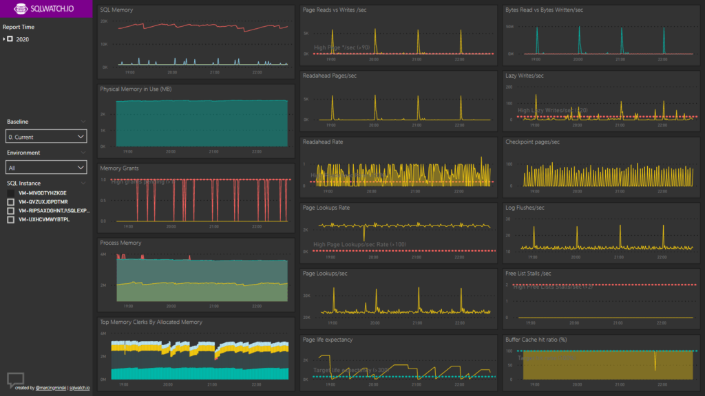
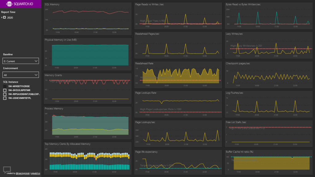
It is important to understand sampling frequency and reporting window in order to achieve accurate results
An example of the SQLWATCH dashboard showing 4-hour reporting window but with different aggregation levels:
Are cumulative metrics the solution?
Cumulative metrics are constantly increasing since the server startup. In order to calculate the actual point-in-time value, a delta must be calculated between two given data points. This introduces reporting overhead and complexity but allows preserving important information when a reduction of data points is desired. Cumulative values are used for fast-changing metrics when losing data points could have an impact.
In order to calculate the actual value, we have to calculate deltas between sampling points. Removing all but first and last data points would reduce the data set. It would reduce the ability to plot an accurate timeline. It would not, however, reduce the total information and the total delta would be equally spread across the timeline. For example, we would still be able to tell how many bytes we transferred over the given period of time but would not have the exact distribution over time. Alternatively, we can just display the very last point as a representative value of the preceding time period.
The same principle applies to aggregating cumulative metrics – do not aggregate them, just calculate deltas over data points spread farther apart.
Sampling frequency of cumulative variable metrics does not impact the overall information, only reduces resolution of the timeline.
The above only applies when the input is variable over time.
When the input is linear we can derive any point in time from two values and time difference. For example, a person’s age is linear and cumulative in nature. We can only get older, and, in contrast to performance metrics, in a linear fashion. Because our age grows linearly and we know when we were born and how old we are now, we can calculate how old we were 2 weeks ago or at any point in the past and the future. Apart from server uptime, there aren’t any linear cumulative metrics in SQL Server as far as I know.
A real-life example?
Imagine two teams digging holes in the ground. The cumulative team would get paid at the end of the month, based on the total of holes they dug. We would not know when each hole was dug but at the end, all holes were completed.
The point-in-time team, however, would only get paid for each individual hole. They would have to get paid for the first hole before starting digging the next hole. There would be a lot of invoices, a lot of paperwork and a very accurate timeline.
Trend tables
The above examples prove that storing high-resolution data impacts storage utilisation and ultimately reporting performance. On the other hand, aggregating results in information loss. By default, SQLWATCH keeps 7 days of low granularity data. The granularity is controlled by the schedule and adjustable by the end-user:
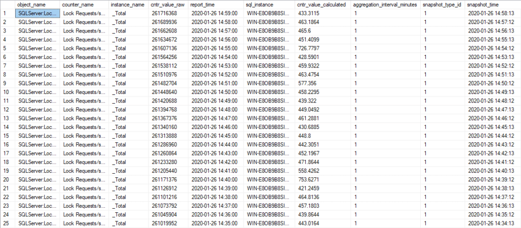
In addition to the high-resolution tables, it keeps aggregated trend data for 2 years. As Brent suggests, the aggregation also includes minimum and maximum for the aggregation period:

The above example clearly shows the benefit of storing average, min and max values. In the highlighted row, the average value alone would not have reflected the almost 10x spike in lock requests.
Power BI to the rescue
I have designed SQLWATCH to provide standardised monitoring and to feed into any data presentation tier and dashboarding tools. It should not be limited to the included Power BI dashboard, however, the reason to use Power BI in the first place was for its ability to analyse relatively high volumes of data points with high-density sampling.
What is high-density sampling
Simply put, it is a very clever algorithm that reduces data points to improve performance but preserves representative data points. It does not lose important information such as spikes and gaps: https://docs.microsoft.com/en-us/power-bi/desktop-high-density-sampling
Keeping the right balance
This is the difficult part which often resulting in aggregation, reduced sampling and essentially throwing away data. Although Power BI’s high-density Sampling is very efficient, it requires high granularity data which can put some load on the source server. I am building SQLWATCH with this in mind. DBAs can select the required aggregation or can let SQLWATCH do it dynamically, based on the time window selected:
>= 8760 then [day] //if window >= 1 year, aggregate over 1 day
>= 168 then [1_hour] //if window >= 1 week, aggregate over 1 hour
> 24 then [15_minutes] //if window > 24 hours, aggregate over 15 minutes
> 1 then [5_minutes] //if window > 1 hour, aggregate over 5 minutes
> 0 then [time] //if window > 0 hours, no aggregation
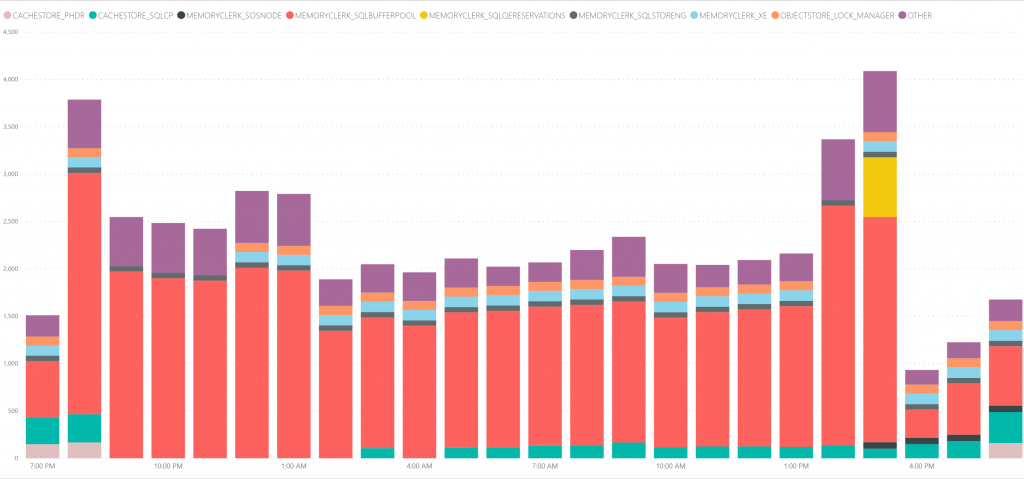
Aggregation reduces the number of rows retrieved from the database and has a significant impact on the report performance. In below example, we can see 24 hours report window aggregated over 5 minute periods. This aggregation results in 21736 rows being retrieved from the Performance Counters table:
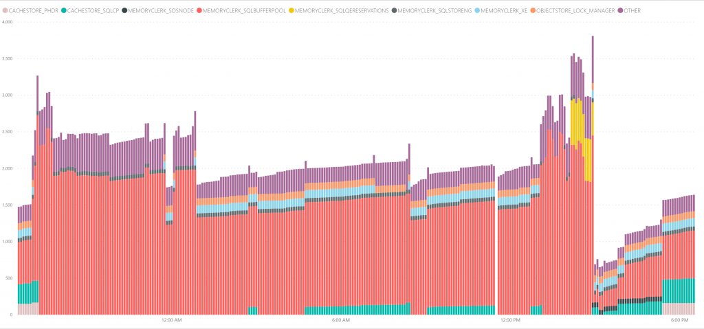

The same reporting window of 24 hours but aggregated over 1 hour period retrieves only 1824 rows and results in much fewer data points:

Conclusion
Cumulative metrics are less prone to low sampling frequency. We will still get the overall information but are not be able to pinpoint the exact time frame. The point in time data is the opposite. In order to preserve the information, we need frequent sampling, which incurs additional overhead.
SQLWATCH relies on cumulative (delta) information and extended events where possible to avoid potential loss of important information and less overhead. However, I am not able to completely avoid point-in-time metrics. By default, the performance data logger triggers every minute which is enough for 90% – 95% of cases. This is unavoidable and something to keep in mind when adjusting up collection schedules.
An important point is the reporting window. If I am investigating a specific incident I always look at the lowest granularity. On the other hand, long-period capacity planning is more complex. I would often look at averages over 6 to 12 months to design the platform for growth. I also investigate spikes and dips to ensure we can handle bursts when needed. Some aggregation is likely unavoidable and with SQLWATCH you get the best of both.
This post was originally published on 27th April 2020.
4 Comments
Leave A Comment Cancel reply
Recent Posts
Want to learn about SQLWATCH?
Marcin Gminski2023-03-28T22:07:01+01:0028th March 2023|0 Comments
SQLWATCH 4.4
Marcin Gminski2022-10-06T15:32:56+01:006th October 2022|0 Comments
T-SQL Tuesday #147 – SQL Server Upgrade Strategies
Marcin Gminski2023-07-06T23:15:07+01:008th February 2022|0 Comments
Should we run SQL Server on the default port 1433
Marcin Gminski2022-03-25T12:40:05+00:007th February 2022|3 Comments
Happy New Year!
Marcin Gminski2022-01-01T18:28:43+00:001st January 2022|0 Comments
I am a Microsoft MVP!
Marcin Gminski2021-12-02T23:15:16+00:002nd December 2021|10 Comments


This is excellent, Marcin. I appreciate Brent bringing it up and you taking the ball and running with it. I wonder if we could envision a system that had some intelligence to use a finer granularity collection/samplig based on certain conditions/events or event just a user request. I also envision more of an eventing model – some way for resources to report when they are hitting peaks and valleys – rather than (or in addition to) sampling.
Hi, Thank you. Have you seen the actions engine? This is partially where I am going with SQLWATCH -> https://sqlwatch.io/sql-server-free-notifications/ . There could be an action that removes low granularity data if there has been no issues after certain time (1, 4, 24 hours?) and only keeps trends and If there has been an issue it will keep the affected window for longer period. Some sampling is OK, some of the “heavy stuff” is already done via extended events and only gets captured when “bad things” happen.
No, I have not seen the actions engine – will def check it out. I like the idea of a “microscope” to bring out when “bad things” happen. :)